
SUPERMARKET
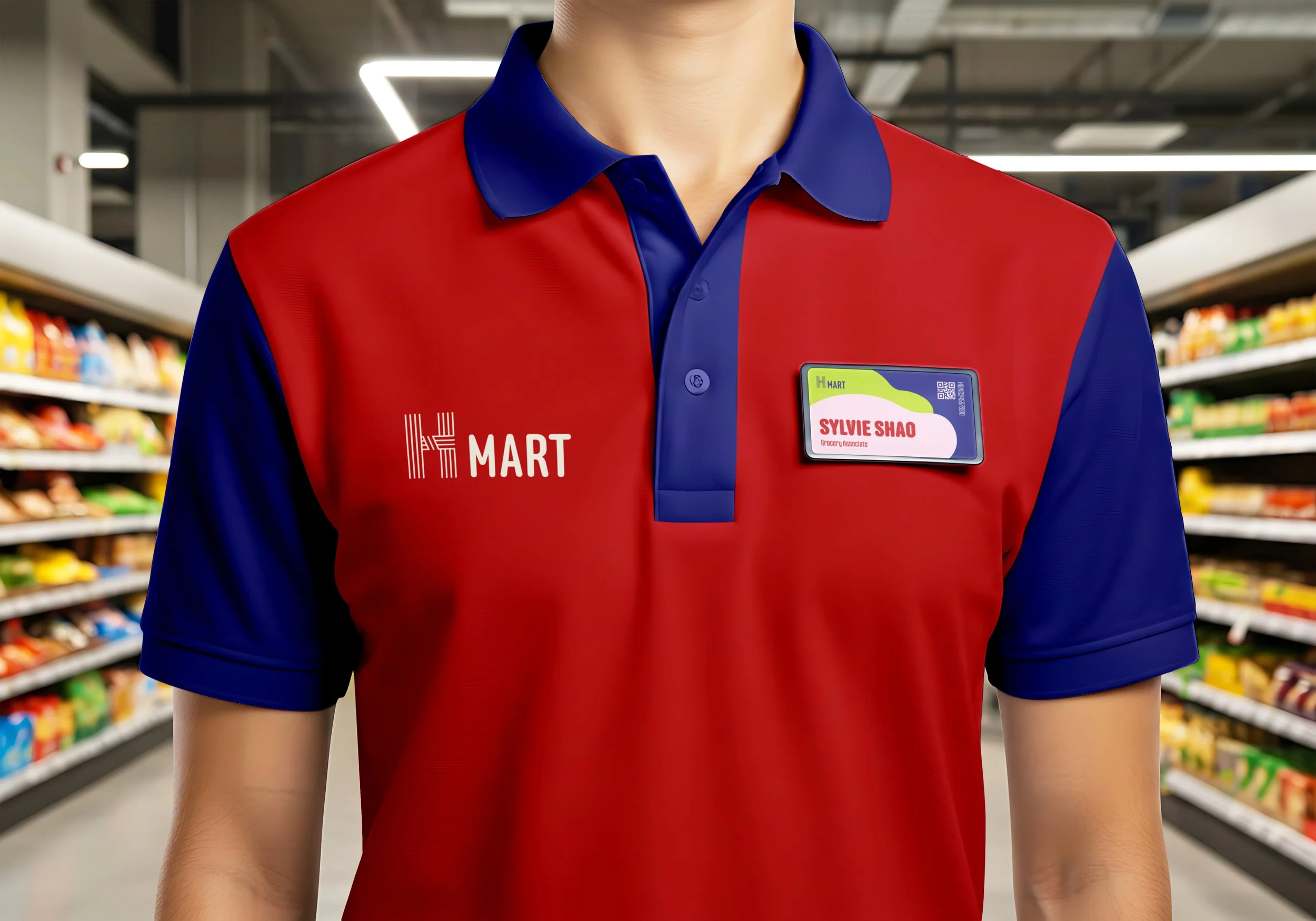
H Mart
Rebranding Identity
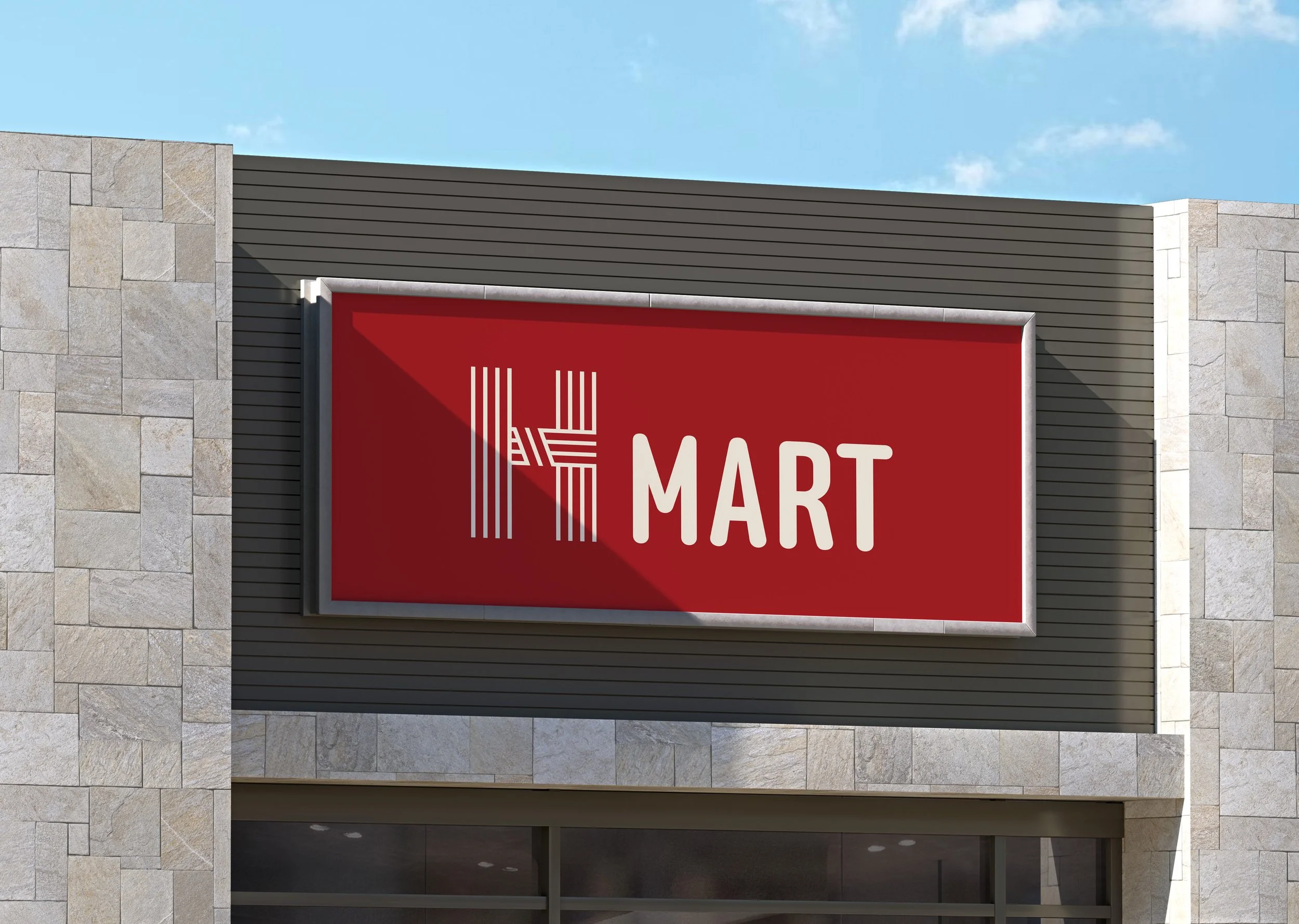
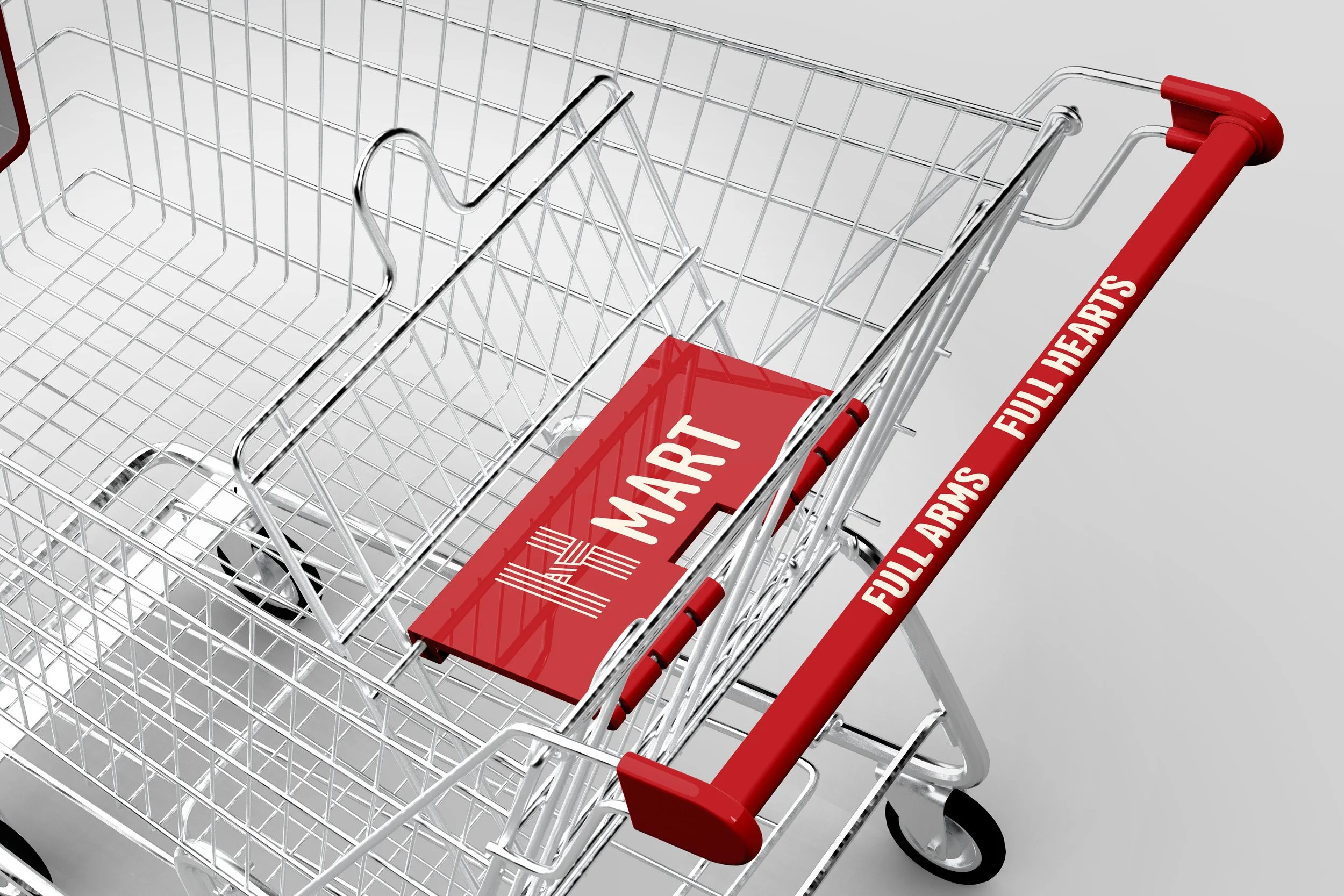
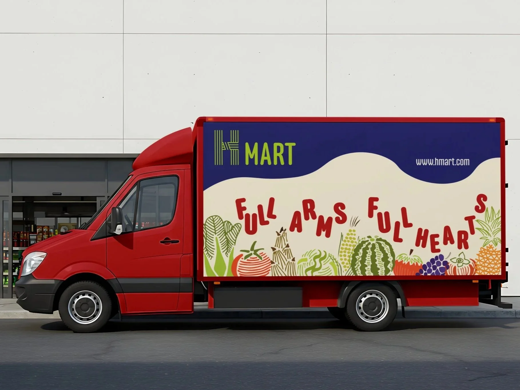
Logo
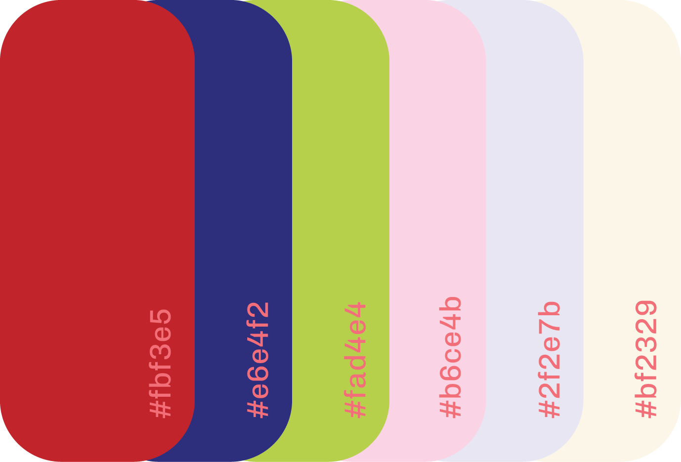
Color Palettes
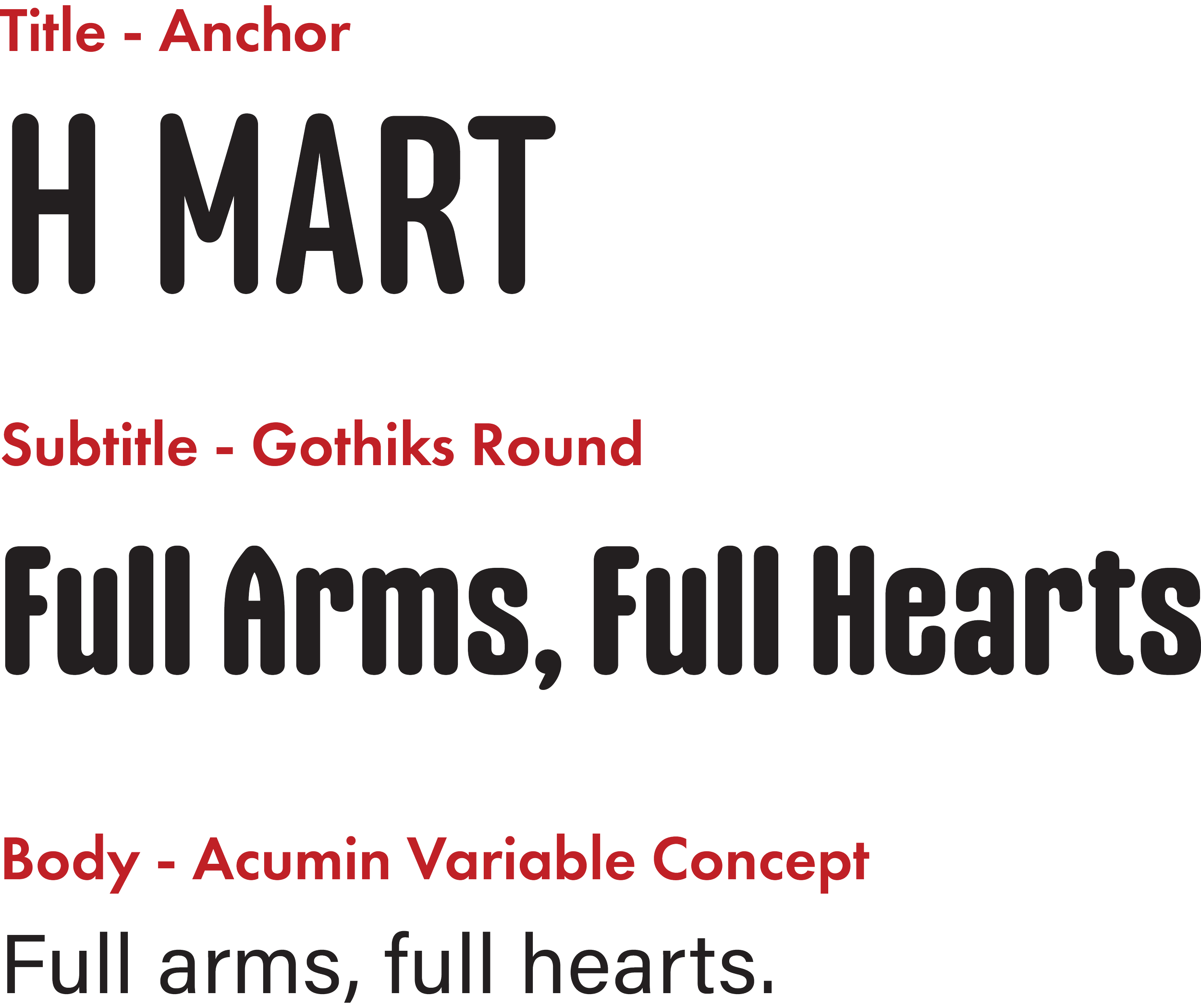
Fonts
HYBRID
KINETIC
PULSE
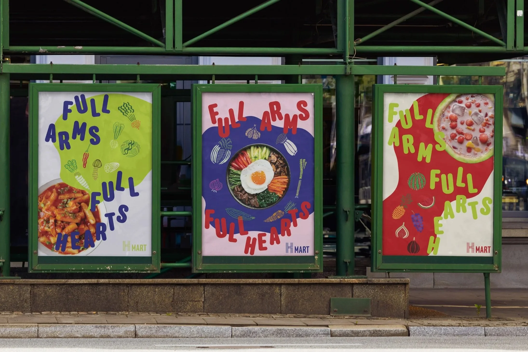
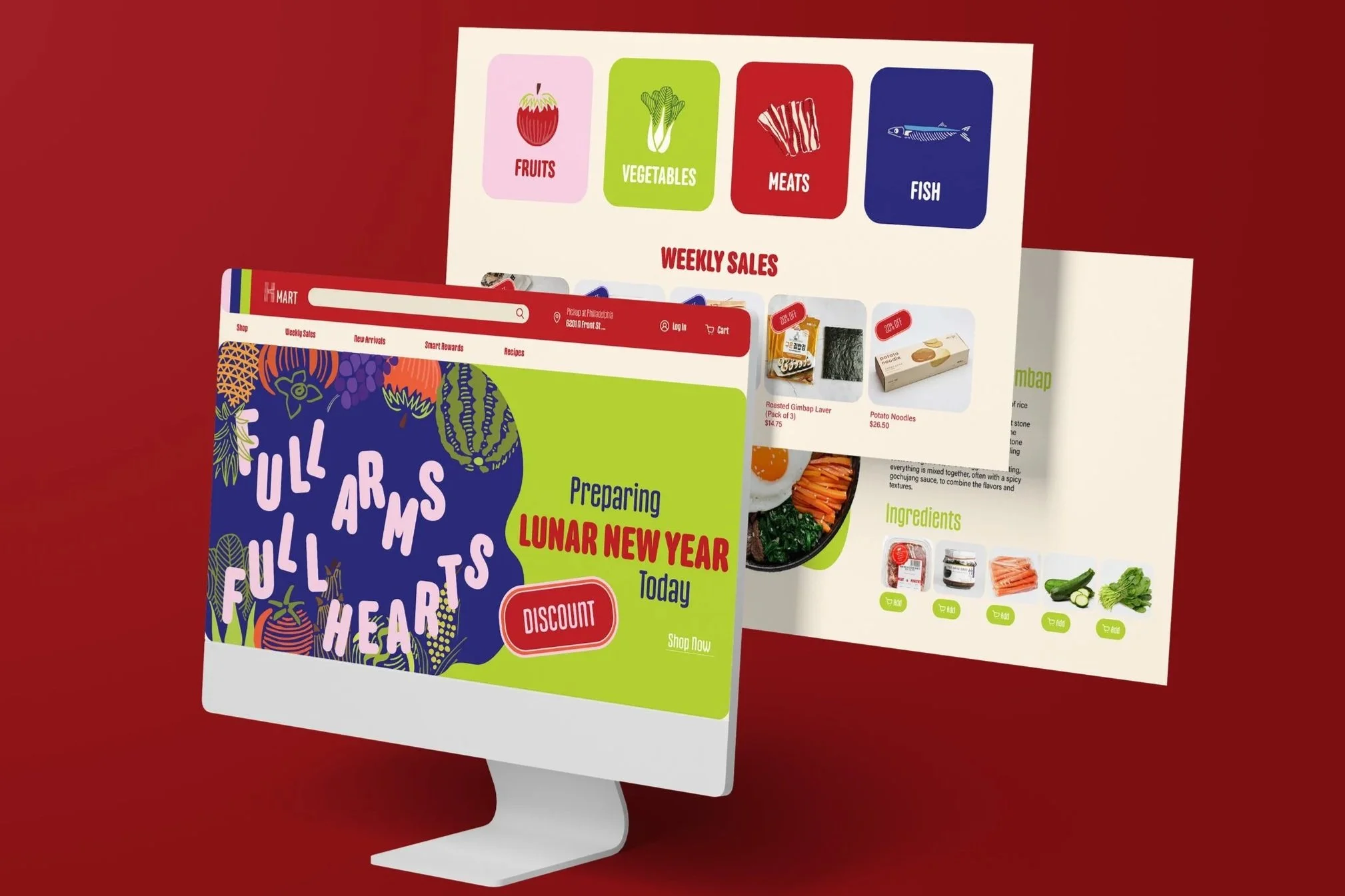
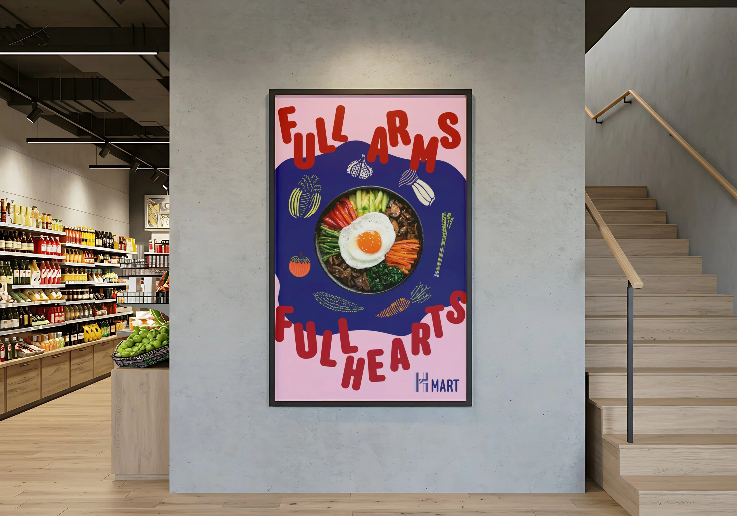
This rebrand repositions H Mart as a vibrant cultural marketplace that bridges Korean heritage with contemporary youth culture. The identity system blends traditional visual references with bold, modern graphics inspired by K-pop energy and global foodie trends, creating a dynamic and inclusive brand presence. By balancing authenticity with fresh visual momentum, the new H Mart appeals to younger audiences while honoring its cultural roots.
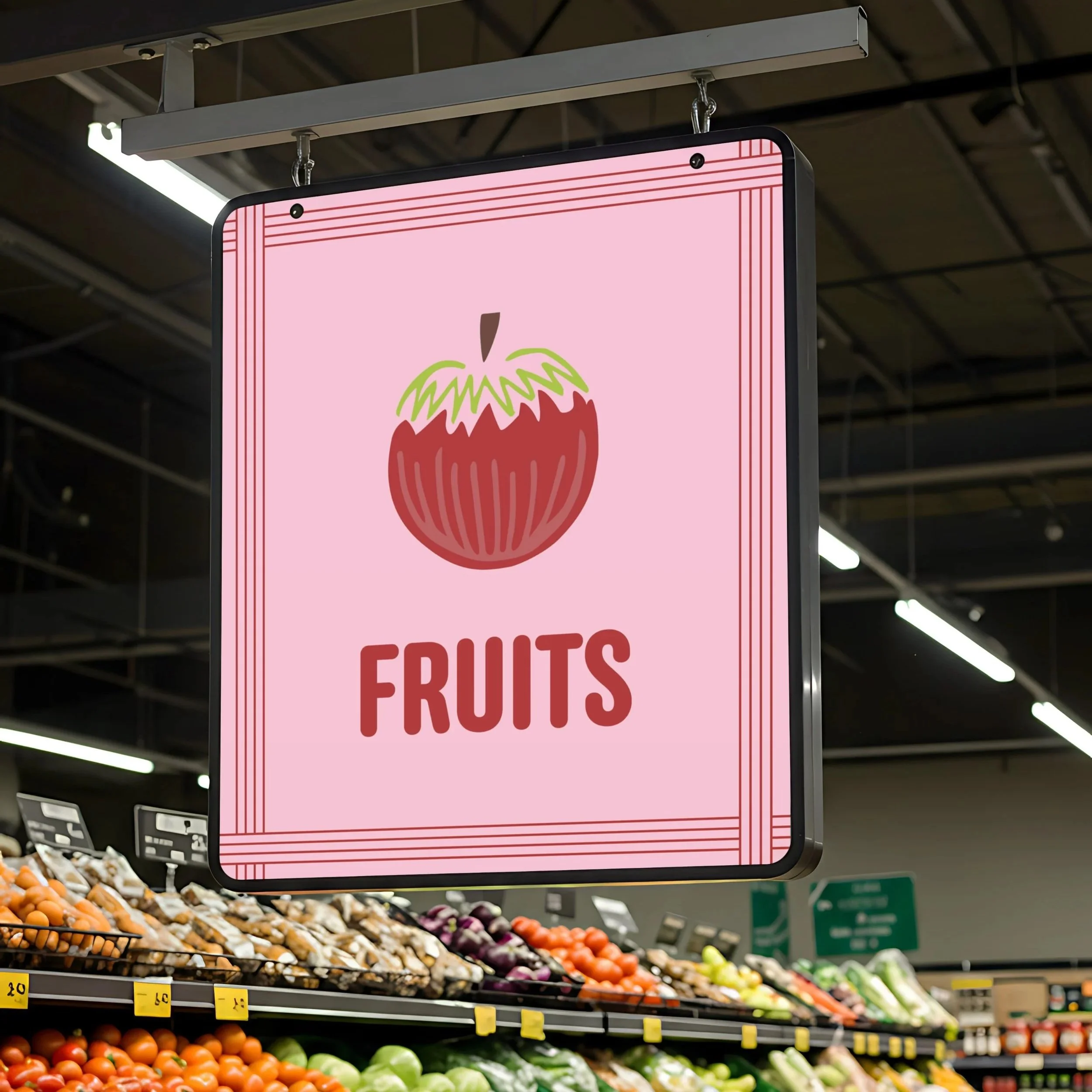
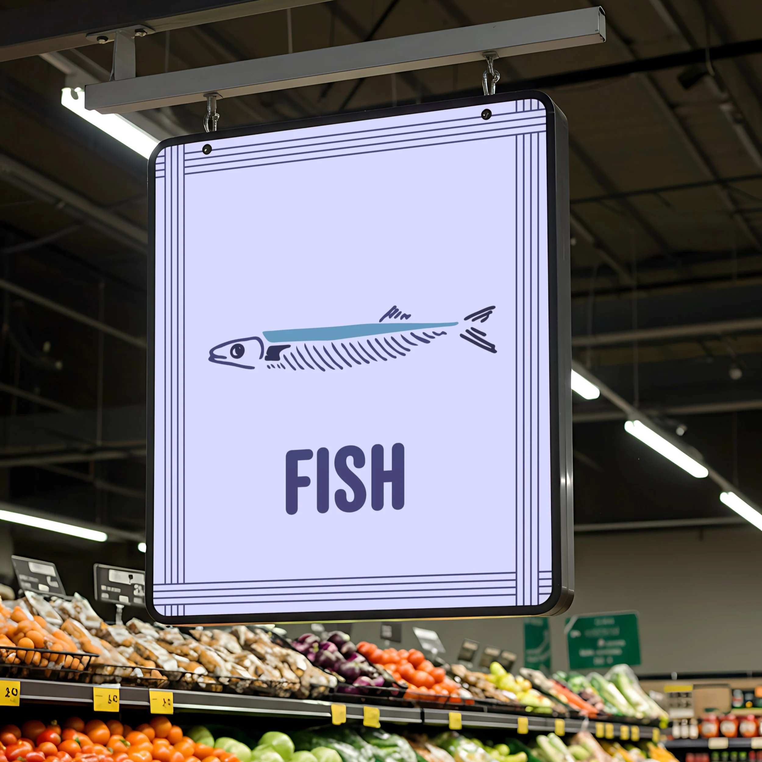
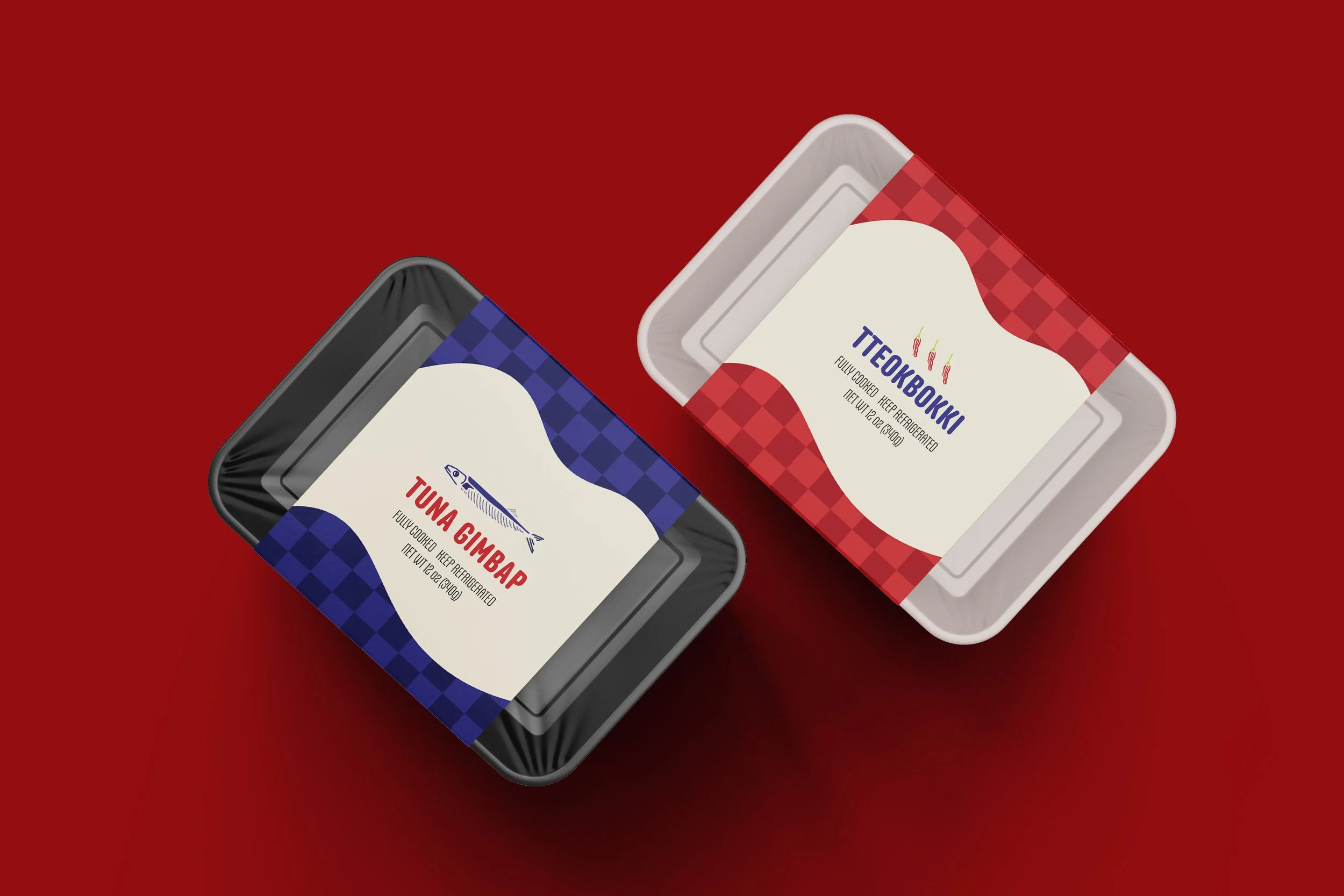
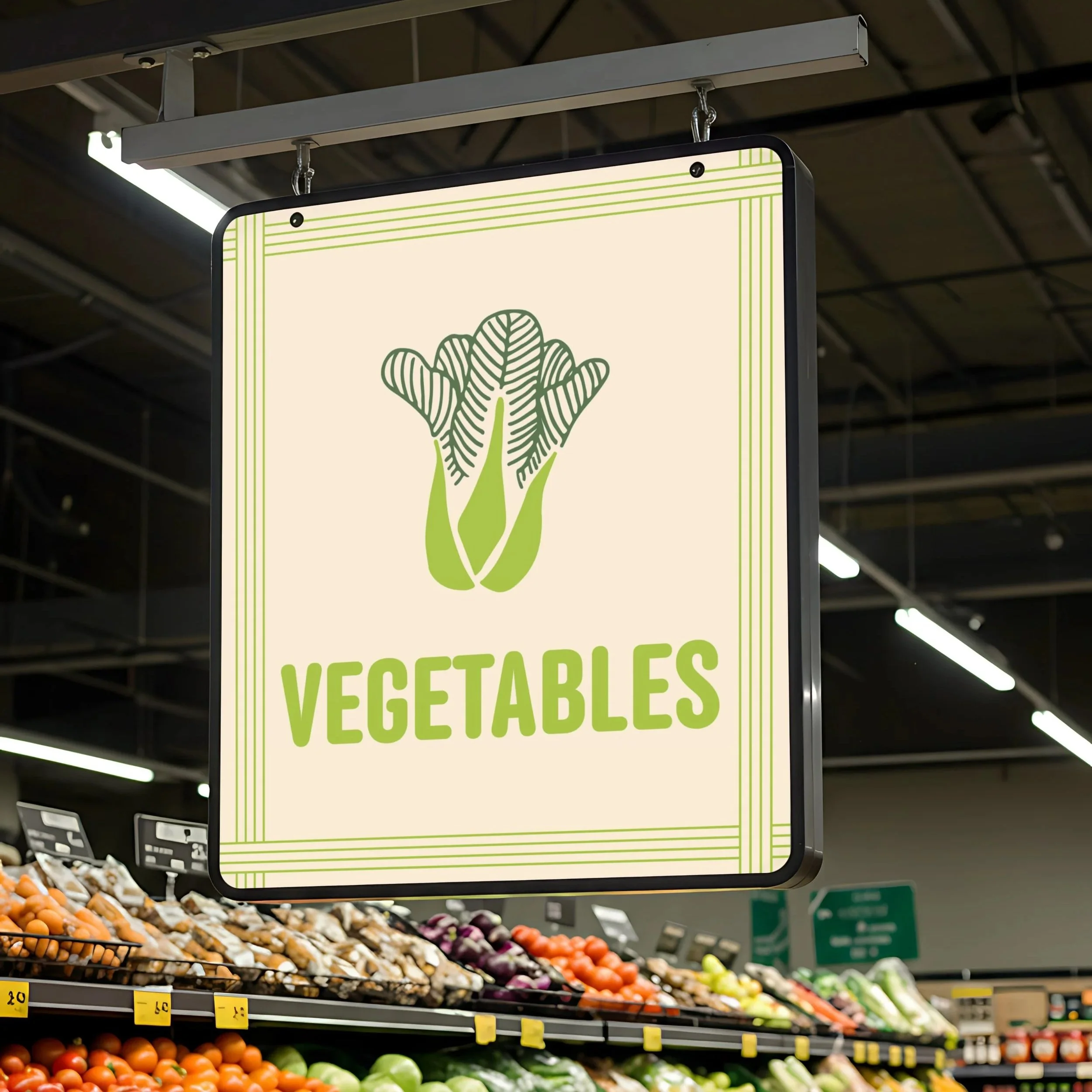
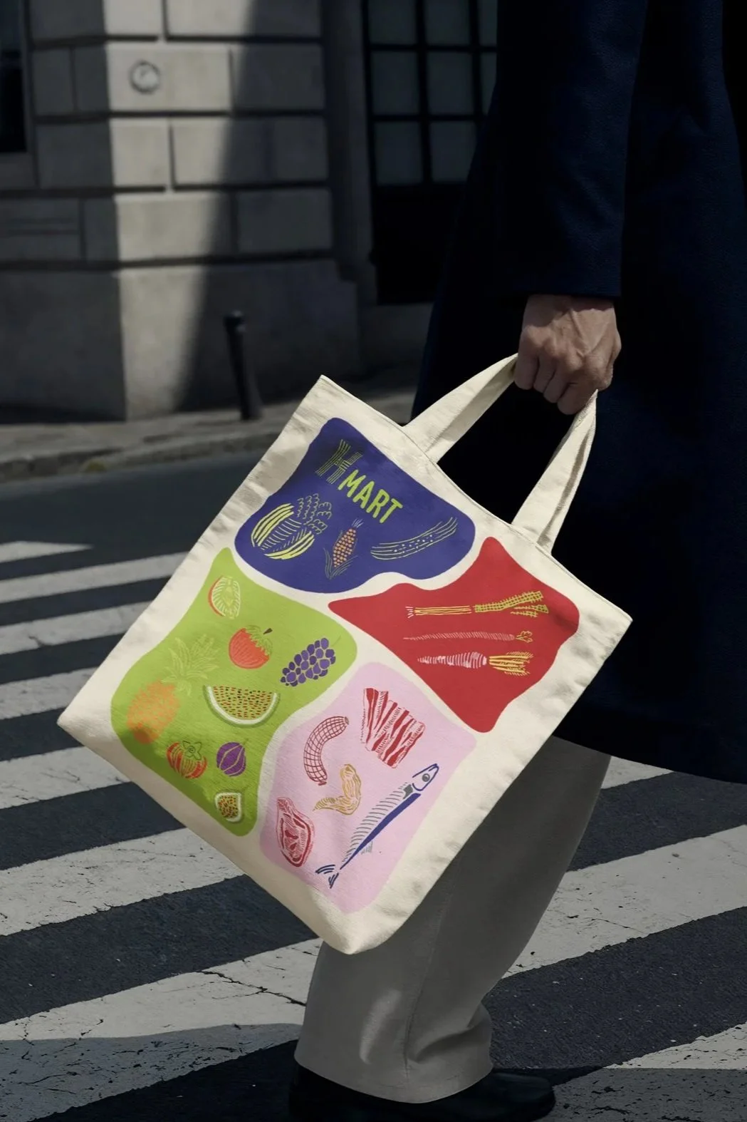
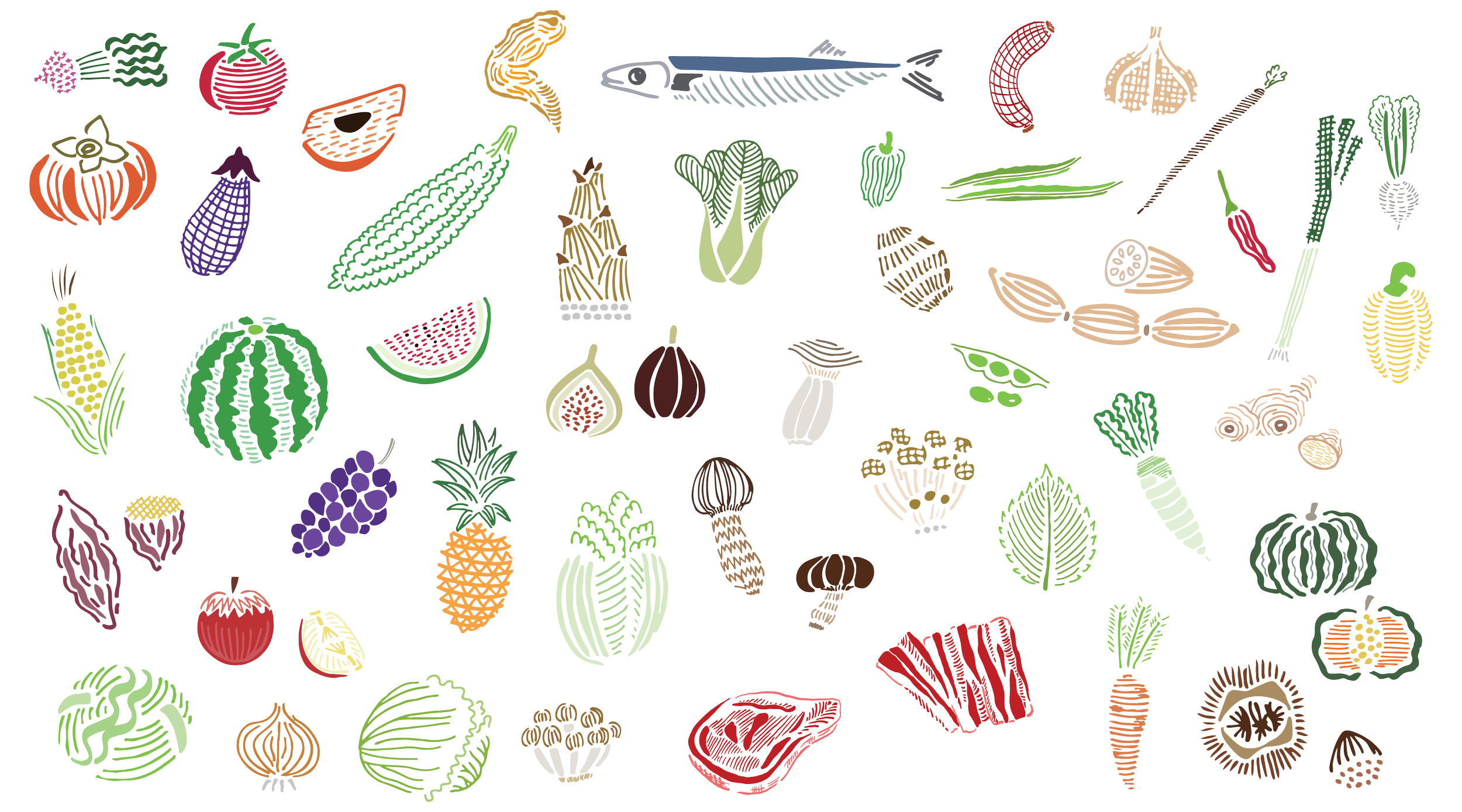
Illustrations
Application Gallery